Hello everyone,
I apologize for my extended absence. It turns out that I don’t write many essays that aren’t for work now that I’m no longer in graduate school; who would’ve thought?
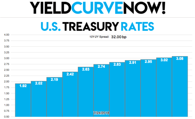
I have in fact been working on a project as of late, however. The problem that I sought to address was the lack of any good yield curve visualizer for U.S. Treasury bonds. You can always go to the Treasury’s website and look at the latest interest rates, yes, but that’s not a great solution for people that feel they could better understand where the economy and business cycle are at with a visualization of the yield curve as opposed to just parsing the raw data. I’m one of those people.
So, I bought the domain www.yieldcurvenow.com and began learning JavaScript.
I want this website to be a no-nonsense, lightning fast resource for those that need to know which way the yield curve is moving on a day-to-day basis. Not only this, I’ll be taking some time to write extensively on www.yieldcurvenow.com to help people understand what a yield curve is, why its shape matters, and the various factors that influence the movements of interest rates.
As always, please let me know if you have any feedback, it would be much appreciated!
-Tyler
